Retail Shopfitting Colour Psychology and Its Impact on Customer Experience
12 December 2023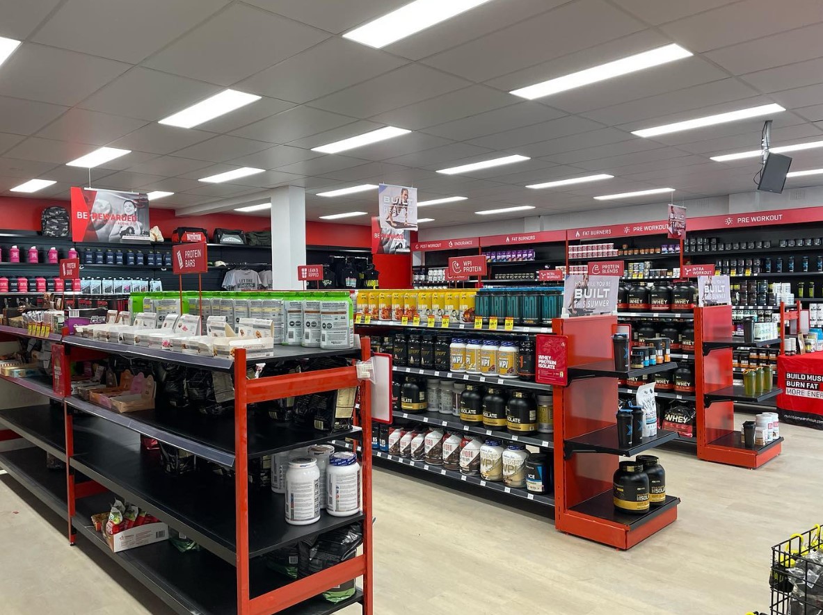
Enhance your customer’s experience with retail shopfitting from Sydney Shopfitters. Explore the impact of colour psychology in retail spaces. Call 02 9521 1398.
Retail shopfitting colour psychology plays a pivotal role in shaping the overall customer experience. Each chosen hue within a retail space is a strategic decision and influences the emotions, behaviours, and perceptions of customers. Warm tones like reds and oranges evoke a sense of urgency and energy, ideal for promoting sales and discounts. Cool colours like blues and greens create a calm and inviting atmosphere, enhancing the overall shopping experience. Neutral tones convey sophistication and timelessness, fostering a sense of trust. The careful selection and combination of colours in shopfitting not only contribute to an aesthetically pleasing environment but also subconsciously guide customers through a journey that aligns with the brand’s identity and objectives, ultimately enhancing their overall satisfaction and likelihood of return.
Creating a Welcoming Atmosphere
The first impression is crucial in the world of retail. When customers enter a store, the colours that greet them play a fundamental role in establishing the atmosphere. Warm and inviting colours, such as shades of blue, green, and earth tones, can make customers feel welcome and comfortable. This initial feeling of warmth encourages customers to linger and explore your store, improving the overall customer experience.
Influencing Buying Decisions
Colour psychology has a profound impact on buying decisions. For example, red is often associated with urgency and excitement, which can prompt customers to make quick decisions. This makes it a popular choice for clearance sales or limited-time offers. On the other hand, green is often linked to health, tranquillity, and nature, which can be particularly appealing for brands focused on wellness or eco-friendly products. Understanding these colour associations allows retailers to strategically influence customer purchasing behaviours.
Branding and Identity
The colours used in your retail fitout can convey a strong message about your brand identity. Consistency in colour schemes across your store, logo, and marketing materials like signages reinforces your brand’s personality and values. For instance, a luxury brand might use muted and sophisticated colours like black, gold, or white to communicate elegance and exclusivity. Meanwhile, a brand targeting a younger, more vibrant audience might opt for bold and energetic colours to convey a sense of fun and adventure.
Wayfinding and Organisation
Effective wayfinding is essential in a retail space. Colours can be used strategically to guide customers through the store and draw their attention to specific areas. For instance, brighter colours or contrasting hues can be employed to highlight key products or store sections. Creating a visual hierarchy through colour can help customers navigate the store more efficiently, enhancing their overall shopping experience.
Lighting and Colour Interaction
The interaction between lighting and colour is a crucial consideration in retail fitouts. Different lighting sources, such as natural light, fluorescent, or warm LED lighting, can alter the appearance of colours. Retailers need to carefully assess how lighting conditions affect the colours chosen for their fitout to ensure they convey the desired emotions and aesthetics under varying lighting conditions.
Colour psychology plays a significant role in shaping customer experience in retail fitouts. By understanding how colours impact emotions, behaviours, and branding, retailers can make informed choices that enhance their stores’ success. Sydney Shopfitters, with our expertise in retail fitouts, can help you select and implement colour schemes that optimise your store’s customer experience and contribute to your brand’s overall success.
Optimized by: Netwizard SEO